
Why desktop?
We learned that customers like to browse on mobile and checkout on desktop. When we did a competitive analysis to compare other e-commerce sites’ executions on navigation, product grids and other marketing vehicles, we discovered that despite our website’s out-of-date look and feel, the way customers access information was challenging. We hoped to create a stronger desktop platform that would instill the new brand tone, follow the conventional site navigation standards and provide flexibility to adapt to any future shifts as our group grow and develop.
“Shoppers only have seconds to determine the trustworthiness and ease-of-use of a website. ”
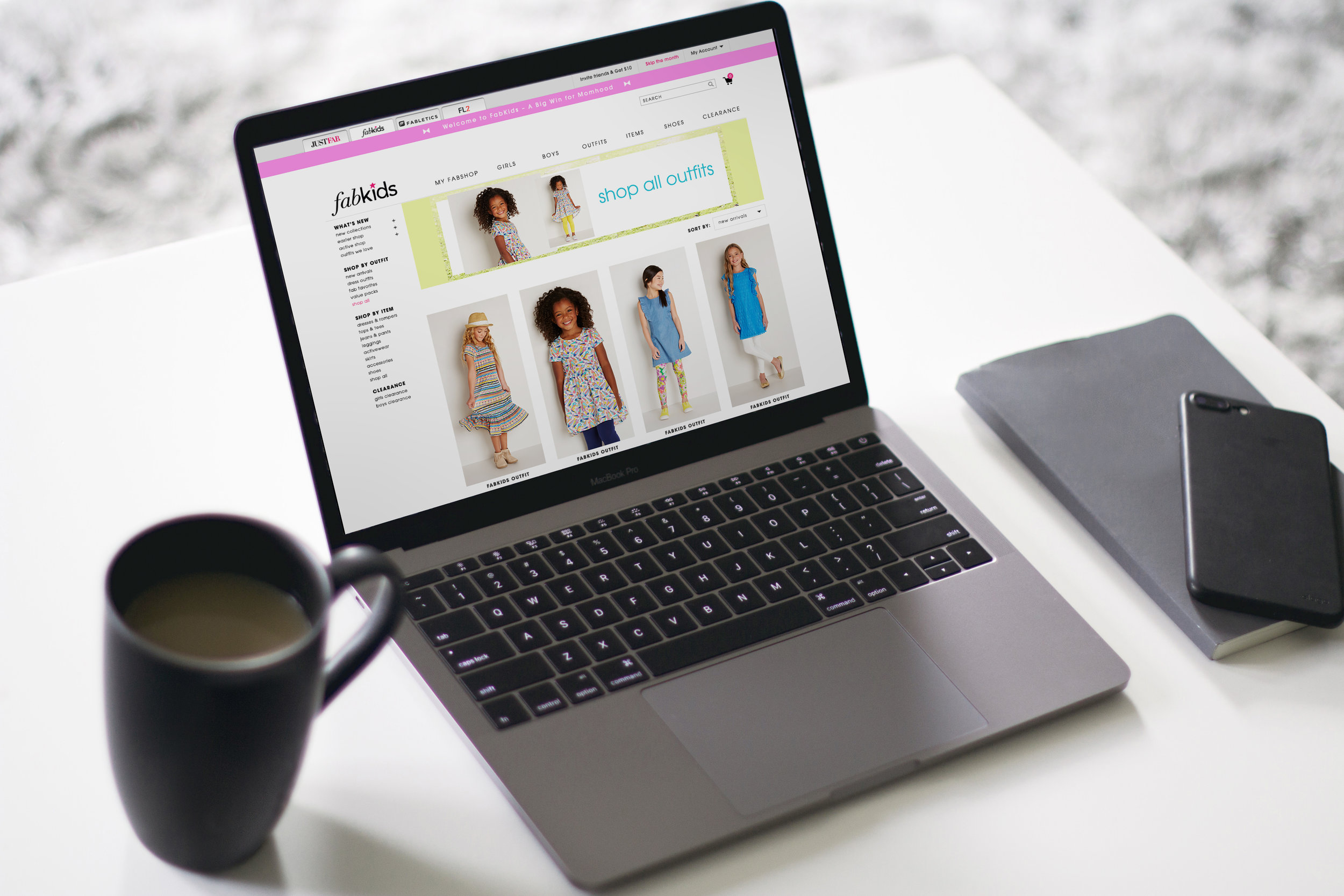
What have we changed?
1. New dropbox box as the alternative marketing vehicle for monthly promotions
2. Interchangeable skinny bar changes with different context
3. Widen site width & change product grid from 3/row to 4/row
4. New big drop down menu and reduced size of the left navigation
5. Clean top navigation design with space to breathe and new location for the brand logo
6. New comprehensive footer with different category labels and links
7. Consistent color scheme and font choice
8. Branded fun lazy-load icon
Positive Impact
New customer conversion rate increased by 16%. Current member order conversion decreased by only 2.7%. We believed that it was due to a slight behavioral change and we were confident that it would turn around positively over time.