
With FabKids’s rapid growth in customer demand, its website has struggled to support the hyper growth of the company. As FabKids.com is the premier kids clothing e-commerce company with no retail storefront, we began to see that we were falling short in contrast to the general e-commerce industry standard and were struggling to evolve our brand direction. FabKids.com was overdue for a 2.0 Update.

I have omitted confidential information in this case study. All information in this case study is my own and does not necessarily reflect the views of FabKids.
The Challenge
We learned that customers like to browse on mobile and checkout on desktop. When we did a competitive analysis to compare other e-commerce sites’ executions on navigation, product grids and other marketing vehicles, we discovered that despite our website’s out-of-date look and feel, the way customers access information was challenging. We hoped to create a stronger desktop platform that would instill the new brand tone, follow the conventional site navigation standards and provide flexibility to adapt to any future shifts as our group grow and develop.
Our main goals:
Create an easy-to-use and consistent shopping experience from desktop to mobile.
Create a platform that could flexibly support future business growth.
Connect our seasonal offerings with the thematic brand aesthetic.
Avoid big surprises and maintain familiarity.
My Role
I spearheaded the design of the site navigation experience and worked closely with two designers on idea brainstorming and feedback. I also worked alongside the product, marketing and merchandising teams to make sure the new design meets the needs of every team.
Research
We’ve always focused on optimizing the mobile platform, until later when we learned that the checkout rate on desktop was higher in comparison to that on mobile. Given that our desktop site was last updated in 2012, we agreed that the update needed to instill the new brand tone, and follow the conventional site navigation standards. We hoped to create a stronger desktop platform that provide flexibility to adapt to any future shifts as our group grow and develop.
The Discovery
The project started with strong brand and marketing initiatives. We thus started by enhancing the site navigation, while not overlooking the needs from every stakeholder in the company. First impressions were crucial because new shoppers would only have seconds to determine the trustworthiness and ease of use of a website. They decide what a page is about based on a quick glimpse what’s in their peripheral vision. When shoppers are exposed to overly complex tasks, they feel lost. We thus needed to provide shoppers with options that are adequate and require less thinking so that they feel that they are in control.
“Shoppers only have seconds to determine the trustworthiness and ease-of-use of a website. We should provide shoppers with options that are adequate and require less thinking so that they feel that they are in control. ”
The 2.0 Update
Alternative Marketing Vehicles
We have relied on pop ups as our main marketing vehicle. With the new dropbox box, we wished to provide alternative interchangeable options for monthly promotions.
Skinny bar
There are certain offerings that stay the same every month, such as Free Shipping. We wanted to integrate an element that wouldn’t compete with new monthly promotions. One suggestion was to add an interchangeable skinny bar which would change into a different content whenever the page reloaded.
Widen site width & change product grid from 3/row to 4/row
Fundamental objective of any e-commerce site is to display products efficiently. By expanding the overall site width (940px to 1145px), we gained more real estate and was able to show more products above the desktop screen folds.
Changing the product grid from 3/row to 4/row allowed shoppers to view more products at a glance, and it also allowed a quicker transition for product displays from desktop to mobile.
Rethink Top Nav
We learned that people have mental models which determine how something works based on past experiences, as a result, we opt for a clean top-level navigation with a big drop down menu. aligning with the common navigation practice. We prioritize the top level navigation by reducing the size of the left navigation.
Space To Breathe
We redesigned the top navigation space first by relocating the logo to the left, emulating how people reading pattern from left to right; secondly, giving space and prominence to all the elements that needed to be included, and third, by allowing space for any potential feature development in the future, such as Search function.
Footer Update
In order to achieve a cohesive shopping experience for our shoppers, we added-in a comprehensive footer with different category labels and links.
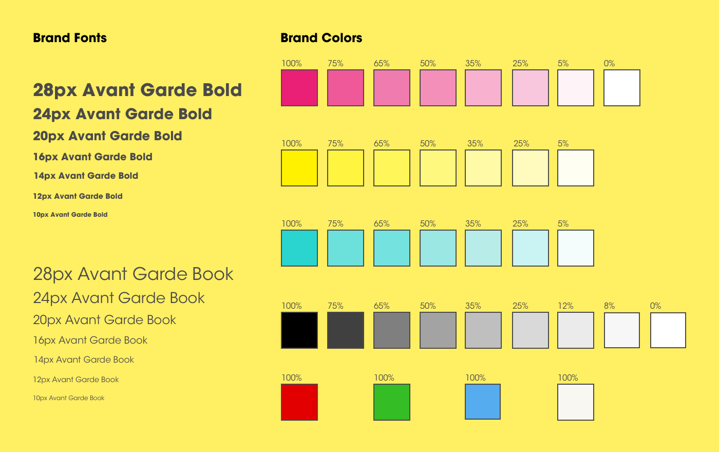
Font and color
We made sure the color scheme and font choices were consistent throughout the site, so that it sets the proper requirements and framework for the website.
Branded lazy load icon
While site speed performance is a separate on-going project, adding fun elements like a gradient loading light bolt would keep a coherent visual experience for the shoppers. This new UI conveys fun and energy, through the placement of a generic progress icon.
Positive Impact
The new customer conversion rate increased by 16%. VIP (Current subscribers) order conversion decreased by only 2.7%. We believed that it was due to a slight behavioral change and we were confident that it would turn around positively over time.
When a project was driven by internal initiatives, the project got too ambitious too soon and we failed to conduct more user research to identify the true user pain points. This was my first ux project, thus it was also a learning process, not only for me as a transitioning UX designer, but also for the company, in fostering a better user experience culture internally.