
← Back to Project Overview
One of FabKids unique features is offering member credit to users who don’t shop or “skip”. However, we had a lot of top decile customers complaining that it was a confusing concept. Questions came up such as how much a credit is worth, how to apply credits, what credits can be used for, etc. We wanted to optimize the credit redemption experience so that customers are able to use the credit that they had saved up, and hopefully by doing so, we would improve the overall conversion.

I have omitted confidential information in this case study. All information in this case study is my own and does not necessarily reflect the views of FabKids.
The Problem Space
Business Problems
Lots of customers had 1+ credits.
Low order rate when customers used their credit.
Business Goals
Increase order conversion by encouraging customers who own 1 credit to redeem the credit before the next month cycle.
Encourage customers to purchase more to reach free shipping threshold.
User Problems
Confused on the member credit redemption - what it includes or excludes, how and where to redeem their credits.
User Goals
To learn what a credit means, how to learn more and where to redeem.
To receive clear and direct communication on redeeming the credit.

My Role
I worked with 2 product managers and 2 engineers, and we focused on design explorations for the onsite experience. We consulted with the creative team on copy and the aesthetic, and with marketing team on the email to site flow, and with the planning team on projections. We constantly reported back to the stakeholders on progress and feedback.
While I stopped working on the project during the second phase of design, the experience gained was important to my further design development.
In 2018, Credit Meter pivoted into Mini-Cart, a feature that allows customers to view and edit the cart while they shop.
The Design Phase
After some marketing research and looking at the variation of trackers done by other retailers, such as jet, glossier, honey, we decided to explore the idea of tracker - in a circle form, cart dropdown, tool tip, progress bar, a shopping bag that fills up as you shop. Later it evolved into “meter" which focused on tracking the number of credits. We hoped to apply the idea to every touch point of our mobile shopping experience, providing clarity while keeping it fun and uplifting.

Concept 1

Concept 2

Concept 3

Concept 4
Iteration 1

As we began to dive deeper into the design, we specified how the tracker would behave at different stages of the user journey.
I gamified the daunting credit redemption task by adding animation (flying confetti/ downward arrow) to emphasize rewards and savings, and giving users a “feel-good” moment so that it would encourage them to reach for the next marker.
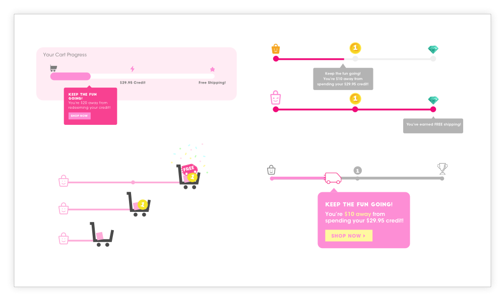
Tracker Scenarios
$0 in cart


Less than $29.95 in cart


$29.95 in cart


$59.00 in cart


Iteration 2
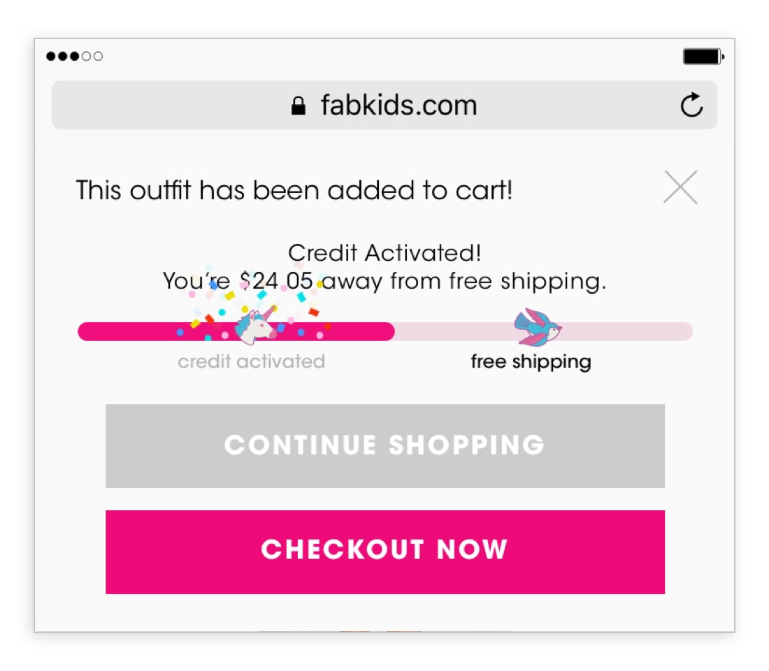
After some discussions and presentations, the team raised concerns on the messaging clarity on the “Added To Cart Modal”. Some argued that the animated downward arrow was distracting users from reading the message. Thus, we revisited and came back with new recommendations.
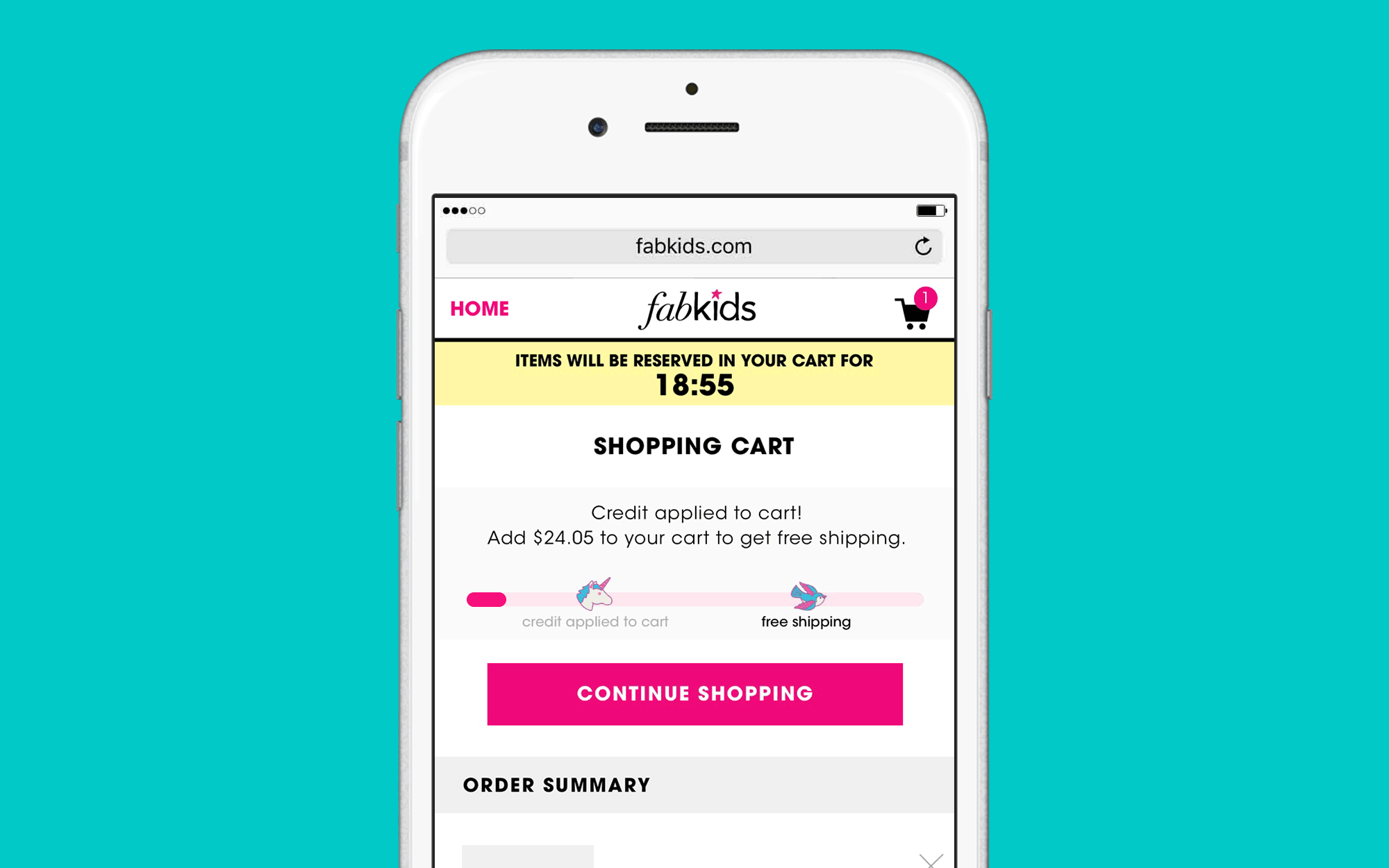
Remove animated down arrow and replace with the original confetti animation. We confined all graphic elements within the progress bar, reducing the distraction from the copy above.
We provided new copy options: #1 specifying the new subtotal, #2 communicates how much you are away from reaching free shipping. The verdict came back with option #2 as the messaging provided best visibility into how much more you need to reach the next marker threshold.


Was it too early to tell?
Although we secured the green light from all stakeholders, we felt a valuable next step was to set up a low level of effort user testing session with our in-house teammates (5-8). We purposefully selected teammates who were not involved in the project to get objective feedback and first impressions, as they were not familiar with the new feature. The goal was to gain feedback on the current credit meter flow design, regarding possible confusing aspects and whether the model was sufficient in understanding what a member credit was.
“Research shows that testing 5 participants reveals 80% of the problems whereas 9 participants reveal 95% of the problems.”
User Testing Objectives
Test if users understand what a member credit is and how to redeem a credit
Test if the new feature prompts users to reach the 2nd marker (Free Shipping)
Test if the new feature is user friendly and easy to navigate..
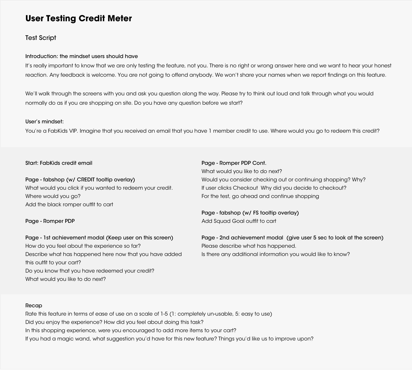

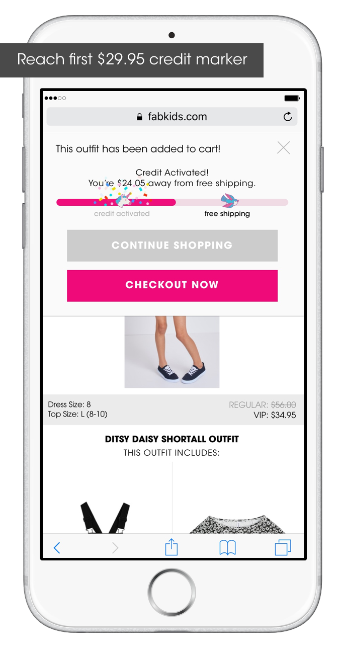
Prototype Key Screens
Try prototype by clicking here


User Testing → Pivot
Our biggest surprises from the user testing was that free shipping (what we expected to incentivize purchase) did not benefit us with customer satisfaction, clarity or drive AOV and units. Instead it created more frustrations and let-down. Although we were not successful in fitting both credit redemption and free shipping objectives into a small feature, we were able to learn from these quick user testing sessions, pinpoint potential user problems and secure instant feedback at an early stage.
This feature was later being de-prioritized back to Icebox. In 2018, the idea pivoted into a mini cart slider with the focus only to reach the free shipping threshold.
Retrospect And Insight
FabKids moved at such a quick pace that projects did not always get the necessary time to fully develop. The credit meter by itself was a unique and fun project where I was able to use the opportunity to conduct informative user testings.
Successful product development requires time and iterations. Unfortunately, we may not always have such freedom, what we can do is to learn from these quick user testing sessions, pinpoint potential user problems and secure instant feedback at an early stage.