
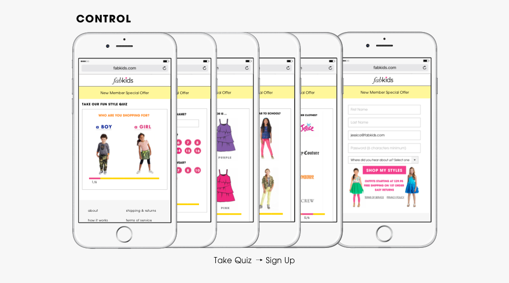
At FabKids, customer conversion through completing the quiz flow was essential and critical to the business. There was a big opportunity space for improvement which we believe will increase the customer conversion. Over years, we’ve tried to tackle the problem space. Here I’ve concluded some design iterations for the over flow and registration page design.
In 2016, we tested skip the quiz for customers resulting in a successful 15% lift in new customer registrations, and 7% lift in visitor-to-vip conversion.
In 2017, we ran a separate A/B tests to optimize the registration page for non-skipper users, resulting a successful 8% lift on visitor-to-vip conversion.
•••
Phase 1: Offer A Skip Quiz Option
Skip the Quiz A/B Test (Mobile)
Hypothesis
Every new customer needs to take the quiz before signing up to shop the site. We know that the quiz is a tool that helps us tell our story of personalized shopping, but we believe that it might be a major barrier to shopping our site.
Our Goal
We wanted to increase registrations by allowing customers to view and shop the products faster. In order not to impact the visitor to member active conversion, we ran an A/B testing to test out the new skipper flow.
The Plan: Testing 2 versions against the control
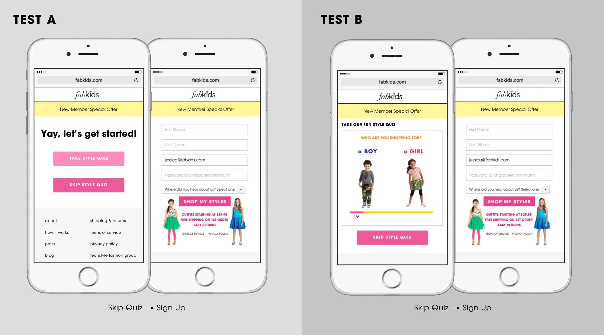
Test A - New Quiz Option Page
Visitor landed on the new quiz option page, then chose the option to “Take Style Quiz” or “Skip Style Quiz”. When visitor proceed with “Skip Style Quiz”, s/he would arrive to the last page of the quiz funnel - Registration Page.
Test B - New “Skip Style Quiz” Button
Visitor landed on the 1st page of the quiz, but with a new “Skip Style Quiz” button as the alternative option to exit the quiz flow. The button would not appear on the rest of the quiz funnel. When visitor proceed with “Skip Style Quiz”, s/he would arrive to the last page of the quiz funnel - Registration Page.
Result
We ran the test for almost 6 weeks. Test A was performing excellent with 15% lift in new customer registrations, and 7% lift in visitor to VIP conversion. We rolled out test A to all new users signing up.
•••
Phase 2: Optimize the Registration Page
Phase 2 (Part 1) Non-Skipper Registration Page A/B Test (Desktop & Mobile)
Hypothesis
We learned that the biggest drop-off for customer conversion was the registration page. We believe that customers were interested in the brand because they completed the style quiz. However, the registration page was the bottle neck where customers abandoned the sign up process. We saw the page as an opportunity for improvement to help reduce the overall registration abandonment rate.
The Plan
To improve the sign up experience, we took the approach to simplify the page. While understanding the first time offering is important, we redesigned the reg page so that it shifts users’ attention to the topmost element of any registration page - sign up fields.
Design Process
During the discovery phase, we went through a couple of design iterations. Given our main objective for the test was to keep user focused on completing the registration, we chose concept 3, the cleanest design, as the final version for the test.
Impact
The test was a successful win after running for only a week. On desktop, we gained over 8% on new customer registration. On mobile, we were also in positive territory, with over 3% gain in new customer to VIP conversion.
Phase 2 (Part 2) Registration Page Optimization for Skippers
With the win from the non-skipper flow, we quickly apply the new design to the registration page for the skippers. We regularly observe user session recording and we discovered that very often, users who were in the sign up process would skip over fields but still proceed with registration. How do we better guide the users through the registration process on the page? We went back to the drawing board and hoped to improve design of the page.

Design Process
We also believed that the number of fields give users an impression of a long and complex sign up process, which led to them skipping a field or two. Ultimately we hope to help users focus on the task at hand, so we improved the experience by breaking the sign up form into 2 sections - First section being focused on the user herself who’s registering for an account and the second section focused on whom she was shopping for. While the second part was not editable until the user complete the first section, it’s less likely that s/he would skip over fields which would reduce error possibility. I also designed form field behavior system, using colors and motion to help users focus on the specific form field.
Final Development Stage
Although I was not involved in the development stage of the project, it was still a valuable design exploration process where i had the opportunity to create multiple design variations for the skipper registration page.
Major Takeaways
The project demonstrates the different design iterations for optimizing the registration flow, from providing options for the users in the sign up process to the registration form design improvement targeting specific segment groups.